Adobe Lightroom
|
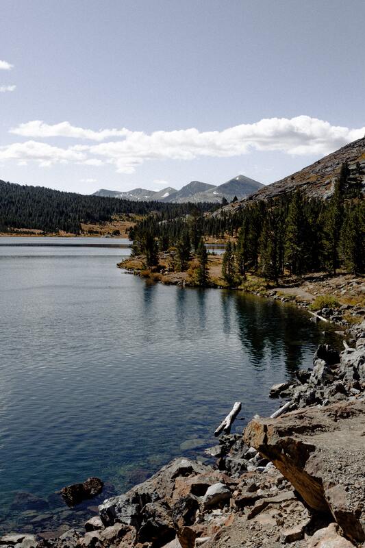
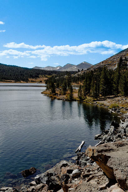
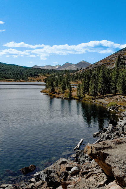
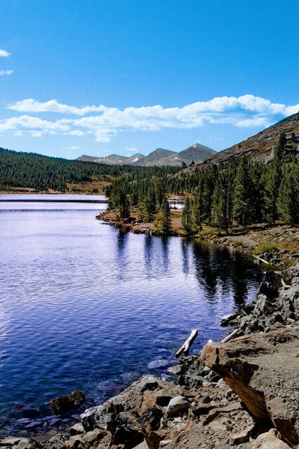
The first mask added was for the sky. In the original image, the sky is too light. This means that, not only is there little colour, but the clouds don't pop out as much. When I masked the sky, I made sure to adjust the temperature to a cooler level in order to add more colour to the sky. I also tinted the sky slightly green to help bring out a deeper blue. Finally, a higher saturation made the blues darker and more present in the sky. All of this helped colour the sky better, as well as make the clouds a more prominent part of the picture.
|
|
|
The second mask was added to the trees. In the original image, the trees are a muddy green, and too dark to give us lots of information. When I masked the trees, I eased off of the shadows and exposed the trees so that they could brighten up and stand out a bit more. I also added a green tint to make the colours look more bright and fresh. Finally, I sharpened the mask so the trees had just enough detail without looking odd. All of this helped the trees look clearer and brighter, and added more colour against the rocks and mountains.
|
|
The third mask was added to the water. In the original image, the water is a dark blue-grey, and doesn't have very much visual contrast. When I masked the water, I started by bumping up the highlights and whites to match the brighter and fuller sky above it. I also made the shadows and black darker, which already made the water look more contrasted. Finally, I increased the clarity, texture, blue temperature and pink tint to bring out the waves and give the water a fuller colour. All of this helped the water look more visually interesting and gave the water a nicer colour that still contrasted the sky and trees.
|
|

|
|
|
