Adobe Photoshop
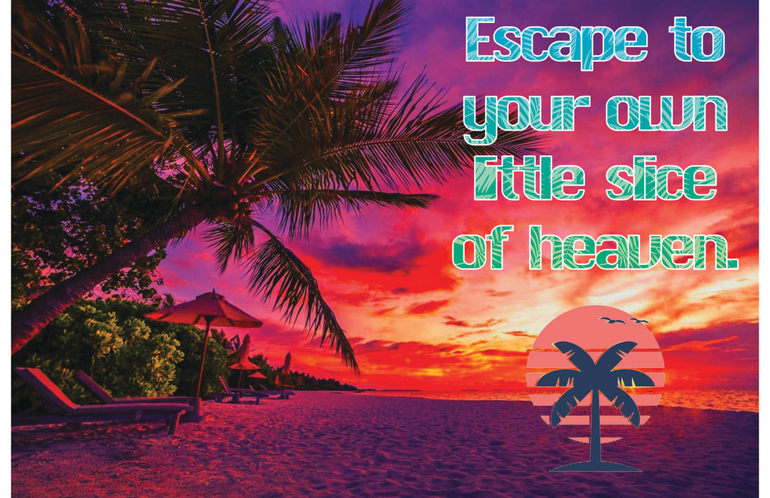
The first step to creating this image was to edit the beach background. I did this by increasing contrast and vibrancy to darken the shadows and make the sunlight glow on the surfaces it touched. Also, adjusting the levels of the image to bring out the red and blue tones and create a more dramatic sunset.
The next step was adding the text. When I found the most suitable font, I added a thin white stroke around the text and tweaked the character spacing in order to make the strokes connect. Using a clipping mask, I placed a palm leaf pattern onto the text and used a gradient with color dodge to add cool colors to the pattern. Finally, after removing the white background from a logo, I placed it under the text without adding effects.
I think my design was successful for three reasons. First of all, there is a strong tonal contrast between the foreground and background that creates a more emotionally impactful image. Also, the color contrast is very effective at making the cooler colored text stand out in front of the warmer background, which makes both simple to read. Finally, the composition of the background (the trees in particular), text, and logo create a very clear and natural line of action to follow.
Multiplicity Shoot
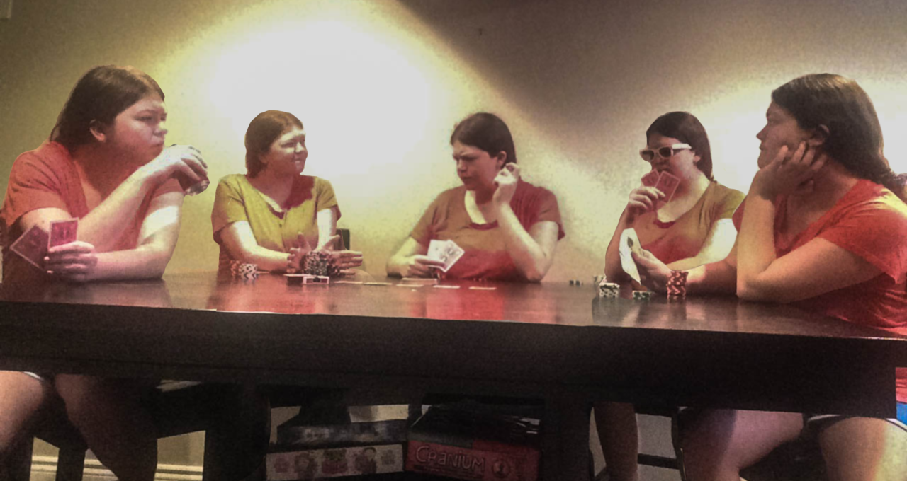
While this shoot could have gone better in many ways (tilted camera, strong overhead light), I believe that I still got the idea that I wanted across. I masked out every instance of myself so that only that instance was visible, with the only exception being the center, which had the full photo, and the right, which included the table. I added a very light Gaussian blur and desaturated the whole image in order to give it a more vintage feel, like it was a photo taken a little while back (as a bonus, the Gaussian blur helped hide the fact that the original images were more pixelated than I wanted). Finally, to counteract the harsh overhead light that was blocking too much information, I lowered the highlights and a bit of the whites to bring the image to a more readable state. This was a very enjoyable assignment to work on, and despite my final product being less polished as I would've liked, I am proud of how it turned out nonetheless.
Mock Ups
|
|
